User Interface Design
A collection of user interface work that I've done. For a peek at a bit more of the process, check out my user experience page as well.
Audio Drama Index
User interface design for a desktop app focused on audio drama podcasts.

Humble Bundle Homepage
Redesign of the homepage for Humble Bundle, a site that offers game bundles and allows purchasers to direct profits towards developers and/or charities.

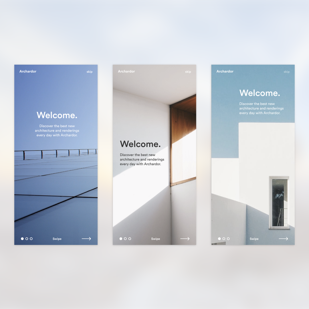
Archardor
Onboarding design for Archardor, an app for architecture enthusiasts and fans.
Screamscape
UI Refresh for Screamscape, a daily blog about theme park news and rumors. The design was kept clean and minimal to focus on the news updates. Yellow from the original site was pulled over as a new brand color. As Screamscape depends on ad revenue, ad space was an important piece of the puzzle in this redesign.

The Score
App interface design for The Score, an app that focuses on connecting users with movie information and tickets by way of their scores and soundtracks.


Circle App Icon Revamp
A revamp of the Circle with Disney app icon. Using some color theory, the four quadrants were shifted to work better together. The four icons were assessed and updated to better match the styles.
The icon was also tested next to other icons on actual screens. This helped best scale the elements of the icon so they weren't too miniscule on an actual screen.
The original Circle with Disney app icon
The redesigned icon brings in some fresher colors that are designed to work together, and is designed to be viewed at icon size.