Trial & Error Book Cover
Everyone judges a book by its cover. How do you leverage that cover to both attract attention while also quickly hitting a target audience and communicating the feel and tone of the book?
Process
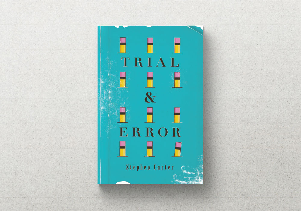
Stephen wanted something that looked a little more retro and distressed.
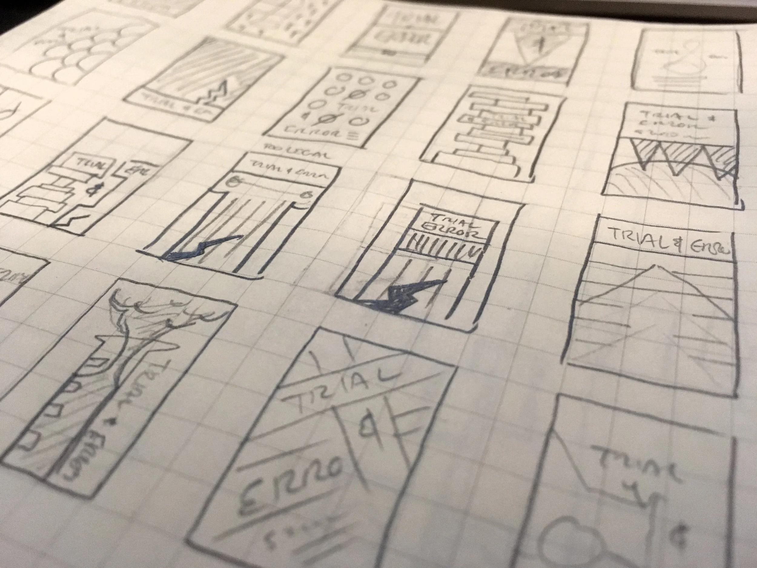
We worked on fleshing out some ideas in a rough maquette stage, seeing how we could communicate the idea through black and white shapes before moving into visual design. This helped spit out a bunch of ideas before diving into fleshing out the concepts digitally.
Iterations
Different ways of representing the writing process. At the same time we experimented with different treatments to give the overall look a retro feel and narrow down the era we wanted to emulate.
Skewing towards modernist design meant leaning on visual metaphor instead of explicitly showing the writing process with crumpled paper in the trash. We tried versions that were more literal and pushed these same concepts into iterations that we more abstract, trying to communicate the idea through shapes and color alone.


Final
The final book was distressed to look like it was well-read. We mixed some retro styles with more modern colors. The final cover design brings the viewer into the process, highlighting the human tendency to focus on errors and failures instead of everything you're getting right in the process.
