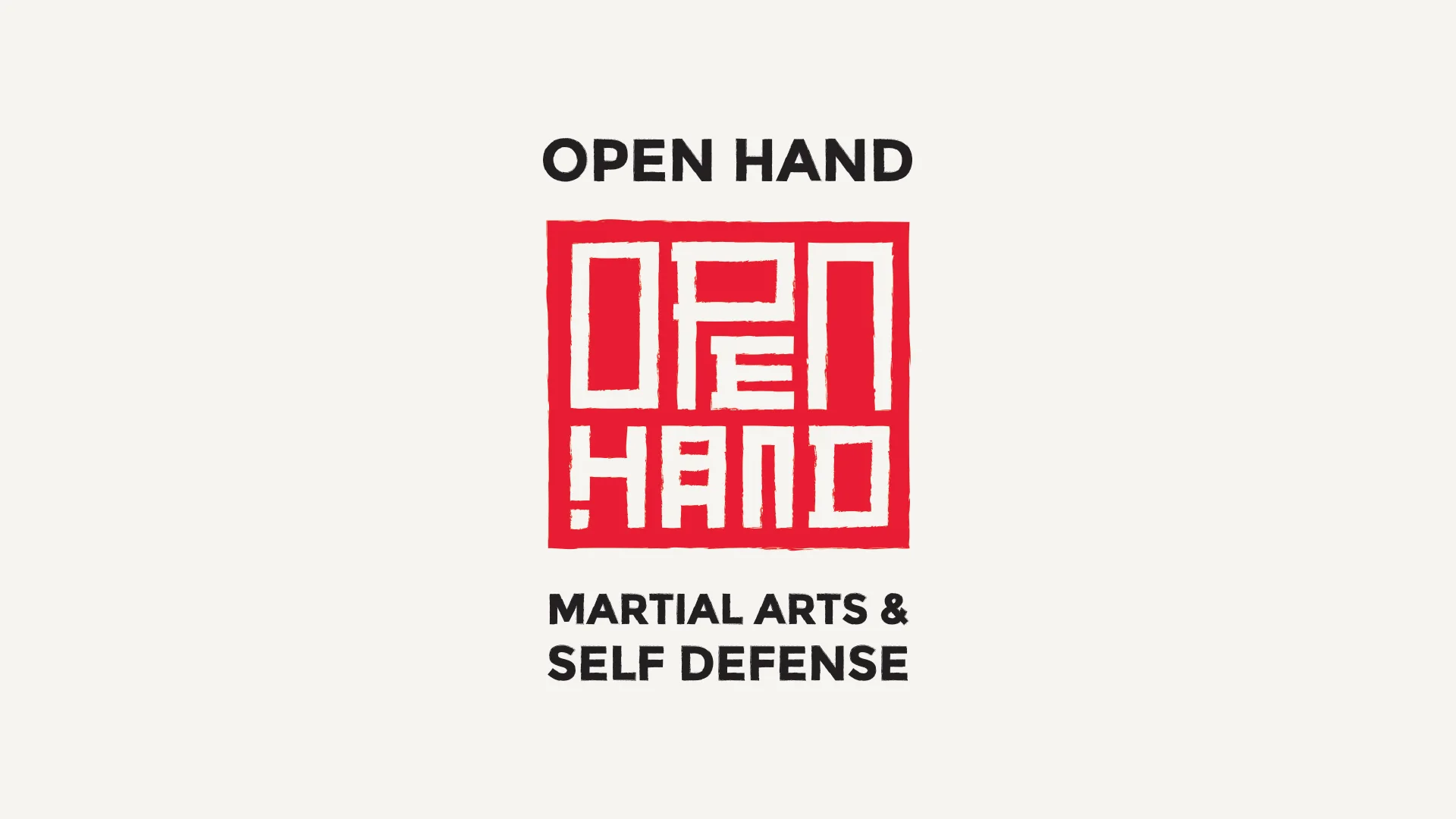
Open Hand is a non-profit academy aimed at teaching classical karate and self defense. The Open Hand brand system incorporates inspiration and ideas from Japan, the home of karate.
The brand system is built on the tatami proportion (2:1). Tatami mats are used as flooring in many Japanese buildings including homes and karate dojos. Their unique proportion created specific room layouts and sizes. The Open Hand brand uses these mat patterns as the basis for document layouts, and the 2:1 ratio for sizing of visual elements and typography.
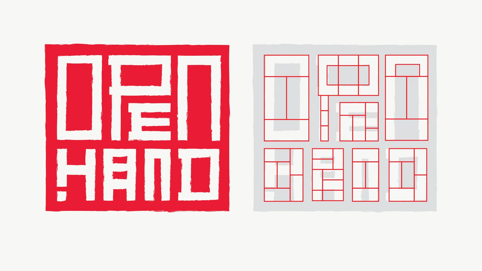
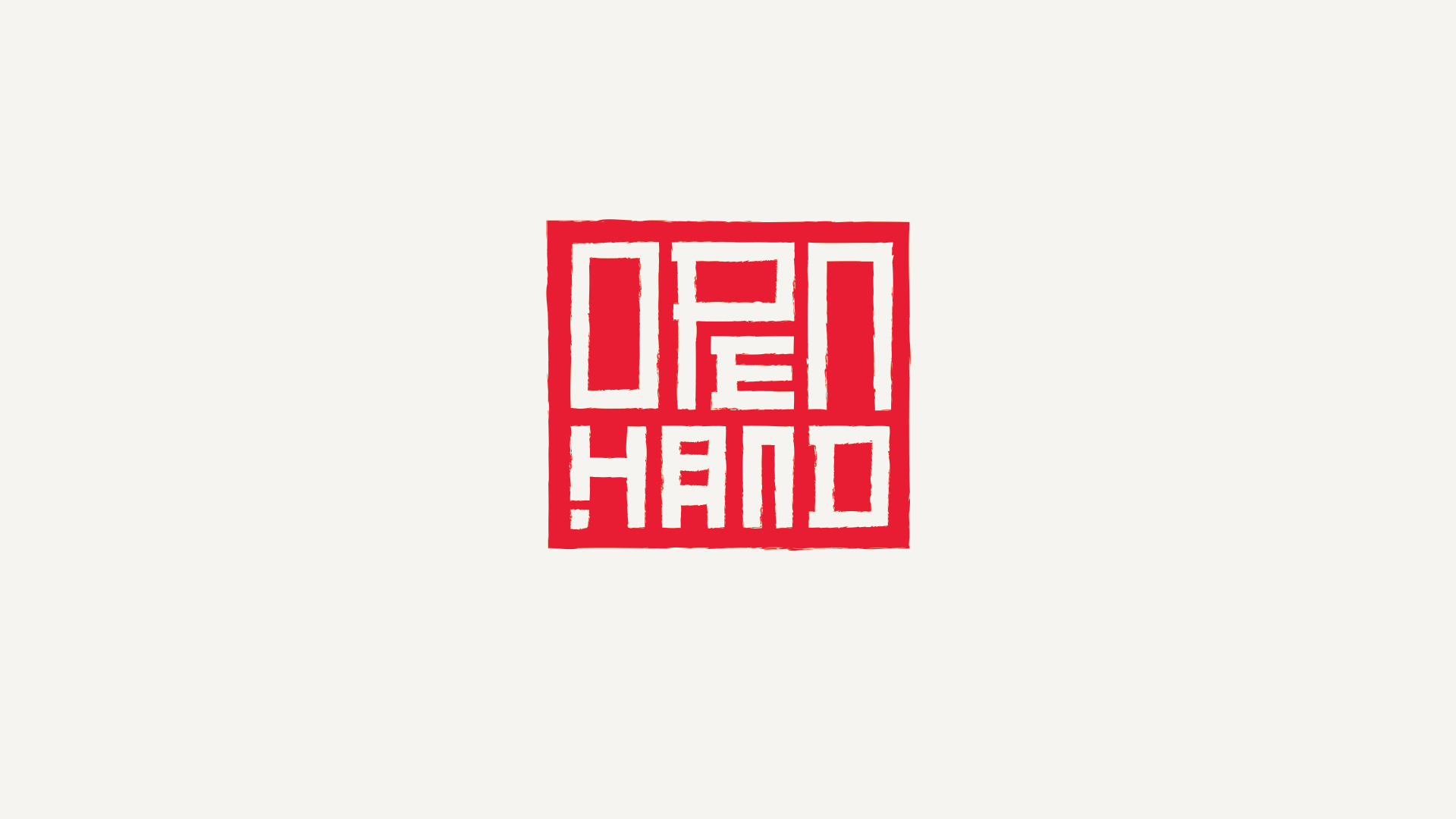
The Open Hand mark carries two Japanese cultural allusions to honor the birthplace of karate. The mark itself (left) is based on a hanko stamp, a red seal used to sign official and personal documents. Elements of the mark are constructed using tatami proportion (right), used here to shape letterforms.

The majority of martial arts branding focuses on combat and is loud, aggressive, and in-your-face. Since this is the opposite of Open Hand's philosophy, we created a brand that was active, yet quiet, fresh, and paid homage to its historical roots.
The Open Hand branding (including the tatami ratio) is carried over onto everything from uniforms to window lettering. The tatami ratio defines not only layout, but type size calculations.
The layout of the Open Hand style guide is an example of using tatami grids as a basis for layout. Inside the guide are color definitions, an overview of the tatami grid system, and lessons on color and logo usage.